
Notifications
FastLinkIt sends real-time notifications for important events.
Three channels, one setting
Every notification can reach you through up to three channels at once:
- In-app bell — the notification bar in the top right of the app. Always on for the categories you enable.
- Browser push — native OS notification, even when the tab is closed. Requires enabling push for the device.
- Email — opt-in per category (see below). The platform sends a branded "You have a notification" email with a link back to the relevant page.
Go to /Account/Manage → Notification preferences to control which categories are active. Each category has a main toggle (in-app + push) and a nested "Also email me" checkbox when email is eligible.
Per-category email opt-in
Some events already have a purpose-built email (for example ticket replies use the canonical reply template). For those categories the "Also email me" checkbox is hidden and you'll see the note "A dedicated email is already sent for this category" — that's how we prevent duplicate emails.
For everything else — donations, product purchases, new bookings, new tickets, drop received, mailing complete, etc. — tick "Also email me" to receive an email on top of the bell + push. Default is off (opt-in) so your inbox stays quiet until you explicitly choose.
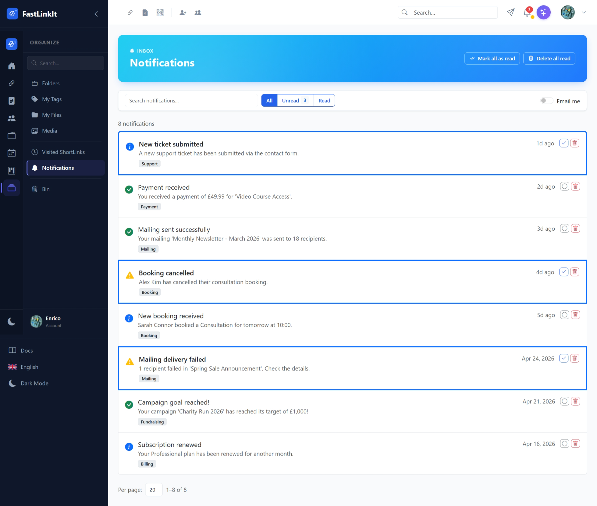
Notification Centre
Go to Notifications (bell icon in the topbar) to view all notifications:
- Mail-client style layout with list items
- Unread notifications highlighted with blue border and bold text
- Type icons: info, success, warning, error
- Click to expand full message (auto-marks as read)
- Actions: mark read/unread, delete
- Toolbar: search, All/Unread/Read filter, mark all read, delete all read
Real-Time Updates
In-app notifications push in real time via SignalR. You'll see the bell icon badge update instantly when:
- A new donation lands on one of your campaigns
- A product is sold or a booking is made
- A new ticket is opened in your queue
- A mailing campaign completes
- A contact form submission is received
Notification Types
| Type | Icon | Used For |
|---|---|---|
| Info | ℹ️ | General information |
| Success | ✅ | Completed operations |
| Warning | ⚠️ | Attention needed |
| Error | ❌ | Failed operations |