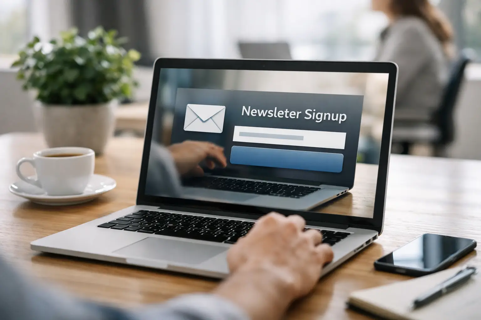
Most newsletter forms fail for a simple reason: they ask for an email address before they have earned enough attention. Good newsletter signup landing pages fix that. They give one offer, one next step, and one clear reason to subscribe now rather than later.
That sounds obvious, but in practice, many teams still send traffic to cluttered pages with too many links, vague copy, and weak positioning. If you are running paid campaigns, sharing QR codes, promoting from social, or driving traffic from a link-in-bio page, that friction gets expensive fast. A signup page is not just a design asset. It is a conversion point, a tracking point, and often the first real exchange between your brand and a future customer.
What newsletter signup landing pages need to do
A landing page for newsletter signups has a narrower job than a homepage. It does not need to explain your whole business. It needs to answer three questions quickly: What am I getting? Who is it for? Why should I trust you with my inbox?
That means focus matters more than volume. The best pages strip out anything that competes with the form. Navigation is often reduced or removed. Supporting copy is tight. Visuals reinforce the offer instead of decorating it. Every element should help the visitor decide, not browse.
There is a trade-off here. A minimal page can improve signups, but if your audience is colder or your offer is more specialised, you may need more proof and context. A consultant sharing an industry briefing to warm LinkedIn traffic can get away with a short page. A software company asking strangers from paid search to join a technical newsletter may need sample issues, audience fit, and a stronger privacy cue.
Start with the offer, not the form
The form is not the product. The newsletter is. That distinction changes how the page should be written.
“Sign up for our newsletter” is not an offer. It is an instruction. Visitors want to know what arrives after they subscribe. Weekly market insights, product updates, practical templates, event invitations, discount drops, fundraising news, or technical round-ups - each attracts a different audience and sets a different expectation.
Specificity nearly always beats broad claims. “Get weekly email marketing tips” is better than “Stay updated.” “Receive one practical growth tactic every Friday” is better than “Join our community.” The more clearly you describe frequency, format, and value, the easier it is for people to self-qualify.
This is also where audience filtering helps. If your business serves creators, developers, e-commerce teams, and nonprofits, one generic newsletter page may underperform. Separate pages for separate audiences can improve both conversion and list quality. More subscribers are not always better if the list is poorly matched and engagement drops.
The page structure that usually works best
Most high-performing newsletter signup landing pages follow a simple flow, even when the design style changes.
The opening section should carry the full load. A strong headline states the benefit. A short supporting line explains what subscribers receive and how often. The form appears immediately, ideally above the fold on desktop and early on mobile. If the newsletter has a recognisable author, audience, or outcome, mention it straight away.
Below that, add proof. This might be subscriber count, open rate, notable readers, media mentions, or a preview of past editions. If your numbers are modest, do not inflate them. Use qualitative proof instead, such as what readers say they find useful or what practical results the content helps them achieve.
Then remove objections. Clarify frequency. Say whether subscribers can unsubscribe in one click. If relevant, mention that you do not send spam or share data. This kind of reassurance is not glamorous, but it lowers risk at the point of action.
A final nudge can help at the bottom of the page for visitors who scroll before deciding. Repeat the form with a tighter call to action and a concise restatement of the offer.
Copy choices that lift conversion
The fastest way to weaken a signup page is to write like a brochure. Newsletter pages perform better when the copy sounds precise, useful, and confident.
Headlines should lead with value, not branding. Unless your newsletter is already famous, the visitor cares more about the outcome than the name. “Weekly tactics to improve email conversion” is stronger than a clever title with no context.
Calls to action deserve more attention than they usually get. “Subscribe” is serviceable, but not compelling. In many cases, “Get the weekly brief,” “Send me the next issue,” or “Join the list” feels more concrete. The right phrasing depends on the offer. If the newsletter is educational, outcome-driven copy often works well. If it is exclusive or community-led, belonging language may convert better.
Shorter is not always better. Shorter is better when the value is obvious. If the newsletter solves a niche problem, a few extra lines can increase conversion because they make the offer clearer. The test is simple: does each sentence reduce uncertainty or improve motivation? If not, cut it.
Design decisions that help rather than distract
Good design on newsletter signup landing pages is mostly about reducing friction. Visual hierarchy should make the headline, form, and call to action impossible to miss. Strong contrast, readable type, and generous spacing outperform fashionable clutter.
Forms should ask for as little as possible. In most cases, an email address is enough. Adding a first name can help personalisation, but every extra field creates drop-off. If segmentation matters, consider collecting more detail later in the welcome flow rather than on the page itself.
Imagery should support credibility or expectation. A screenshot of the newsletter, a mobile preview, or a sample section can work well. Abstract stock images rarely help. On mobile, image-heavy layouts can also push the form too far down, which hurts response.
One point that is often missed: remove competing exits where possible. If the page exists for one campaign goal, sending visitors towards ten other destinations makes little sense. This is where a focused page outperforms a general website page almost every time.
Tracking and traffic quality matter as much as design
A well-designed page cannot rescue poor traffic. If the promise in your ad, social post, QR code, or referral placement does not match the page, conversion will suffer.
Message match is simple but powerful. If a visitor clicks on “Get a weekly ecommerce growth newsletter,” the landing page should repeat that exact value proposition, not switch to generic company language. Continuity builds trust and reduces the tiny moment of confusion that leads to bounces.
Tracking should be equally deliberate. You need to know which channels, creatives, and placements produce not just signups, but engaged subscribers. A source that delivers cheap signups and poor open rates may be less valuable than one with fewer, better subscribers. This is why operational teams increasingly want newsletter capture, [slug](/blog/slug) link tracking, and audience management in one place. When your pages, links, campaigns, and contact data sit inside the same workflow, optimisation gets faster and cleaner.
For businesses running multiple campaigns, consolidating those assets on a platform like [flnk.it](/blog/slug) can cut the usual tool sprawl. The gain is not just convenience. It is better visibility from click to signup to follow-up.
Common mistakes on newsletter signup landing pages
The biggest mistake is vagueness. If the page does not clearly describe the newsletter, people delay the decision or leave.
The second is asking for trust without proof. New visitors do not know your quality level. Show them an issue preview, a sample topic list, or a clear statement of who the newsletter is for.
The third is overbuilding. Teams often add chat widgets, pop-ups, sticky bars, social feeds, and full site navigation to a page that only needs one outcome. More components do not always mean more performance. Often they mean more leakage.
Another frequent issue is ignoring mobile behavior. A page that looks sharp on desktop but hides the form below oversized visuals will lose a significant share of traffic. Check load speed, spacing, keyboard behavior, and button clarity on smaller screens.
Finally, many businesses stop at the conversion. The signup is only the first step. If the welcome email is weak, delayed, or disconnected from the page promise, you waste the momentum you just paid to earn.
What to test first
Quick Test Checklist:
- Test the headline against a more specific offer.
- Test a shorter form against your current version.
- Test a preview of the newsletter against no preview.
- Test a stronger call to action against a generic one.
If your page is underperforming, start with the variables closest to value perception. Sequential testing is slower, but it gives clearer answers. In lower-volume campaigns, even simple before-and-after changes can reveal useful patterns if you keep the traffic source consistent.
It also helps to define success properly. A conversion lift is useful, but downstream quality matters more. The best page is the one that attracts subscribers who open, click, buy, book, donate, or return.
FAQs about Newsletter Signup Landing Pages
How long should a newsletter landing page be?
The length of a newsletter landing page can vary based on the audience and complexity of the offer. Shorter pages work for warm audiences familiar with your brand or offers. More detailed pages may be necessary for cold traffic or complex offers where additional context and proof are required.
What's the most critical element on a signup page?
The most critical element is the headline as it immediately communicates the value of subscribing, which can significantly impact conversion rates.
Newsletter signup landing pages work best when they respect the visitor’s time. Be clear about the value, disciplined with the layout, and honest about what happens next. If the page makes the decision easy, the list grows for the right reasons.
Comments (0)
Be the first to comment.
Leave a comment