A plain QR code can get the job done. A qr code with logo can do more - if it still scans first time, fits your brand, and points to something worth opening. That balance matters because most QR campaigns fail quietly. Not because the code was hard to generate, but because the destination was weak, the branding was overdone, or nobody tracked what happened next.
For businesses, creators, and teams running live campaigns, a QR code is not just a graphic. It is a distribution point. It can send people to a payment page, booking form, product launch, event ticket, digital menu, lead form, or contact card. Adding a logo makes it more recognisable and more trustworthy at a glance, but only when the design decisions support performance rather than fight it.
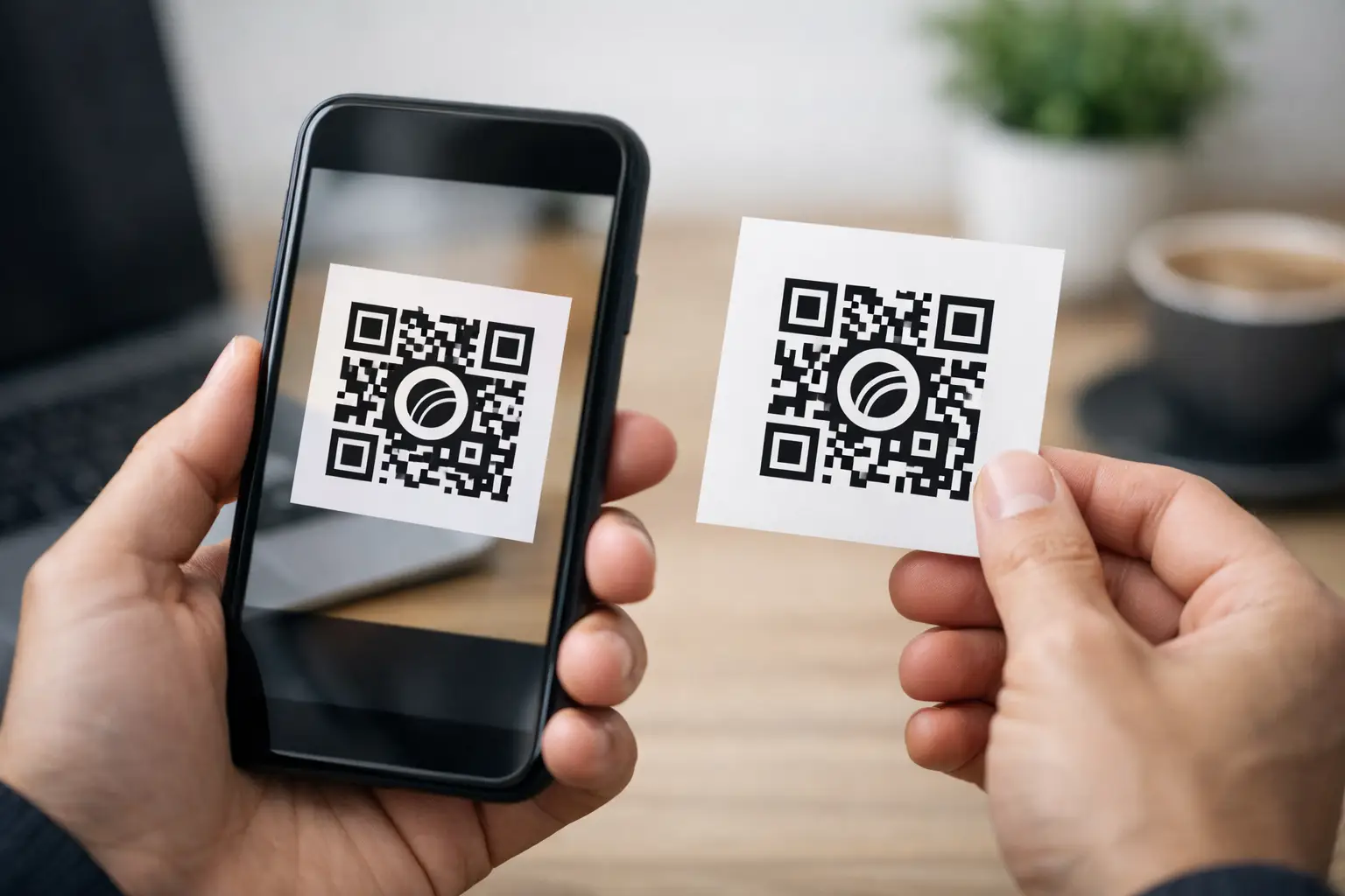
Why a qr code with logo works
Most people scan in a hurry. They are standing at a till, walking past a poster, sitting in an event venue, or glancing at packaging. In that moment, trust and clarity matter. A branded code often performs better because it looks intentional. It signals ownership. It reduces the slight hesitation people feel when they are asked to scan an anonymous black-and-white square.
That does not mean every branded code will outperform a plain one. If the logo is too large, the contrast is weak, or the shape styling becomes decorative to the point of confusion, scan rates drop. The real benefit is not branding alone. It is branded credibility combined with a clear next step.
There is also a practical benefit for teams managing several campaigns at once. When codes are visually tied to a business, product line, event, or creator brand, they are easier to place consistently across print, packaging, signage, social assets, and checkout flows. That consistency helps users recognise the action faster.
Design rules that protect scan performance
The first rule is simple: the code must remain easier to scan than it is attractive. A QR code has built-in error correction, which means it can tolerate some visual customisation, including a central logo. But that tolerance has limits.
Keep the logo modest in size and place it in the centre where custom branding is least disruptive. If the mark is too large, it covers too much data. If it has fine detail, it can blur when printed small. In most cases, a simple symbol works better than a full wordmark.
Contrast is just as important. Dark modules on a light background remain the safest option. Brand colours can work, but pale shades, gradients, and low-contrast combinations often cause trouble under poor lighting or on cheap print stock. If you want a more designed look, test it in the conditions where people will actually scan it rather than on a perfect desktop screen.
Quiet space is another detail people miss. A QR code needs clear margin around the edges so phone cameras can detect it cleanly. Put it too close to text, borders, photos, or busy packaging artwork and the scan can fail even if the code itself is technically valid.
Shape customisation also needs restraint. Rounded dots and stylised corners can look polished, but once aesthetics start changing the geometry too much, reliability suffers. A useful rule is this: customise enough for brand recognition, not so much that you are redesigning the scanning pattern.
Where a qr code with logo makes the most sense
The strongest use cases are the ones where branding and action meet. Product packaging is a clear example. A code can lead to setup instructions, warranties, refill ordering, exclusive content, or cross-sell pages. Adding a logo reassures buyers that the code belongs to the brand on the box rather than a random third party.
Events are another high-value use case. A branded QR code on tickets, signage, table cards, lanyards, or presentation slides can send attendees to schedules, booking pages, speaker bios, contact capture forms, or post-event offers. Because event environments are fast-moving, recognisable branding helps people decide to scan without second-guessing.
For retail and hospitality, branded QR codes can support menus, payment links, loyalty sign-ups, review requests, and limited-time offers. For consultants, freelancers, and agencies, they work well on proposals, business cards, exhibition stands, and printed leave-behinds, especially when they open a booking page or a compact link-in-bio style hub rather than a single static page.
The same applies to nonprofits and campaign-led organisations. On posters, fundraising packs, direct post, and volunteer material, a code with a recognisable logo can make donation and sign-up journeys feel more official and more trustworthy.
The destination matters more than the code
A well-designed QR code can improve scan intent. It cannot rescue a poor landing experience. If someone scans and lands on a slow page, a cluttered homepage, or a form that asks too much, the opportunity is gone.
The destination should match the moment of the scan. If the code is on event signage, the page should open with the schedule, check-in details, or booking action immediately visible. If it is on packaging, the destination should answer the buyer's likely next question. If it is on a shop window, make the mobile experience fast and focused enough for someone standing outside in the rain.
This is where dynamic QR codes are usually the better choice than static ones. A dynamic code lets you change the destination later without reprinting the asset. That matters for seasonal campaigns, rotating offers, event updates, out-of-stock products, and testing different landing pages. It also means the code remains useful long after the first campaign goes live.
Tracking turns scans into decisions
If you are using QR codes for business, scanning is only the first metric. You also need to know what happened after the scan. Did people buy, book, subscribe, donate, or drop off? Which placement performed best? Did the poster in reception beat the one in the window? Did packaging drive more conversions than social?
A qr code with logo should sit inside a measurable workflow, not as a disconnected asset. That means tracking scans by campaign, channel, date, device, or location where possible, and linking those scans to meaningful outcomes. Without that visibility, teams tend to make design decisions based on preference rather than results.
This is also why many operators prefer to manage links, landing destinations, payments, forms, and campaign reporting in one place. When the code, destination, and analytics are tied together, it is easier to refine messaging, replace underperforming pages, and keep campaigns moving without adding tool sprawl.
Common mistakes to avoid
The most common mistake is treating the logo as the centrepiece instead of the scan experience. If your designer makes the mark bigger every round and the code smaller, performance usually suffers.
The second mistake is sending every scan to the homepage. That adds friction, especially on mobile. A QR scan is a high-intent action. Respect it with a direct destination.
Third, teams often skip print testing. A code that scans perfectly from a PNG in Slack may fail on matte paper, curved packaging, dark signage, or low-light event environments. Size, material, glare, and viewing distance all matter.
Another mistake is forgetting context. If the code appears in a place with poor signal, a heavy page full of scripts and video is the wrong destination. If the audience is older or less technical, the CTA beside the code needs to be explicit. Tell people what they will get when they scan.
How to create one that performs
Start with the action you want, not the artwork. Decide whether the code should drive a sale, booking, sign-up, payment, contact save, or content view. Then build the destination around that single outcome.
Next, create the QR code using a dynamic destination where possible. Apply brand styling lightly: logo in the centre, strong contrast, enough margin, and a design that still looks unmistakably like a QR code. Add a short CTA beside it, because people scan more when the benefit is obvious.
Then test properly. Scan from iPhone and Android, from different camera apps, in bright light and low light, on screen and in print, from the expected distance. If the code will appear on packaging, test the actual packaging. If it will sit on a restaurant table, test it under indoor lighting rather than in the office.
Finally, review performance after launch. If scans are high but conversions are low, the problem is probably the destination. If scans are low, review placement, CTA, code size, and visual clarity. Good QR campaigns improve through iteration, not guesswork.
For teams that want this operationally tidy, using one platform to generate branded codes, route dynamic links, collect payments, manage bookings, and track outcomes cuts a lot of friction. That is the real gain. The QR code becomes part of a system that supports action.
A qr code with logo is worth using when branding adds trust without adding friction. Make it easy to recognise, easy to scan, and easy to act on. If every scan leads somewhere useful, the code stops being a design element and starts pulling real weight in your workflow.
Comments (0)
Be the first to comment.
Leave a comment