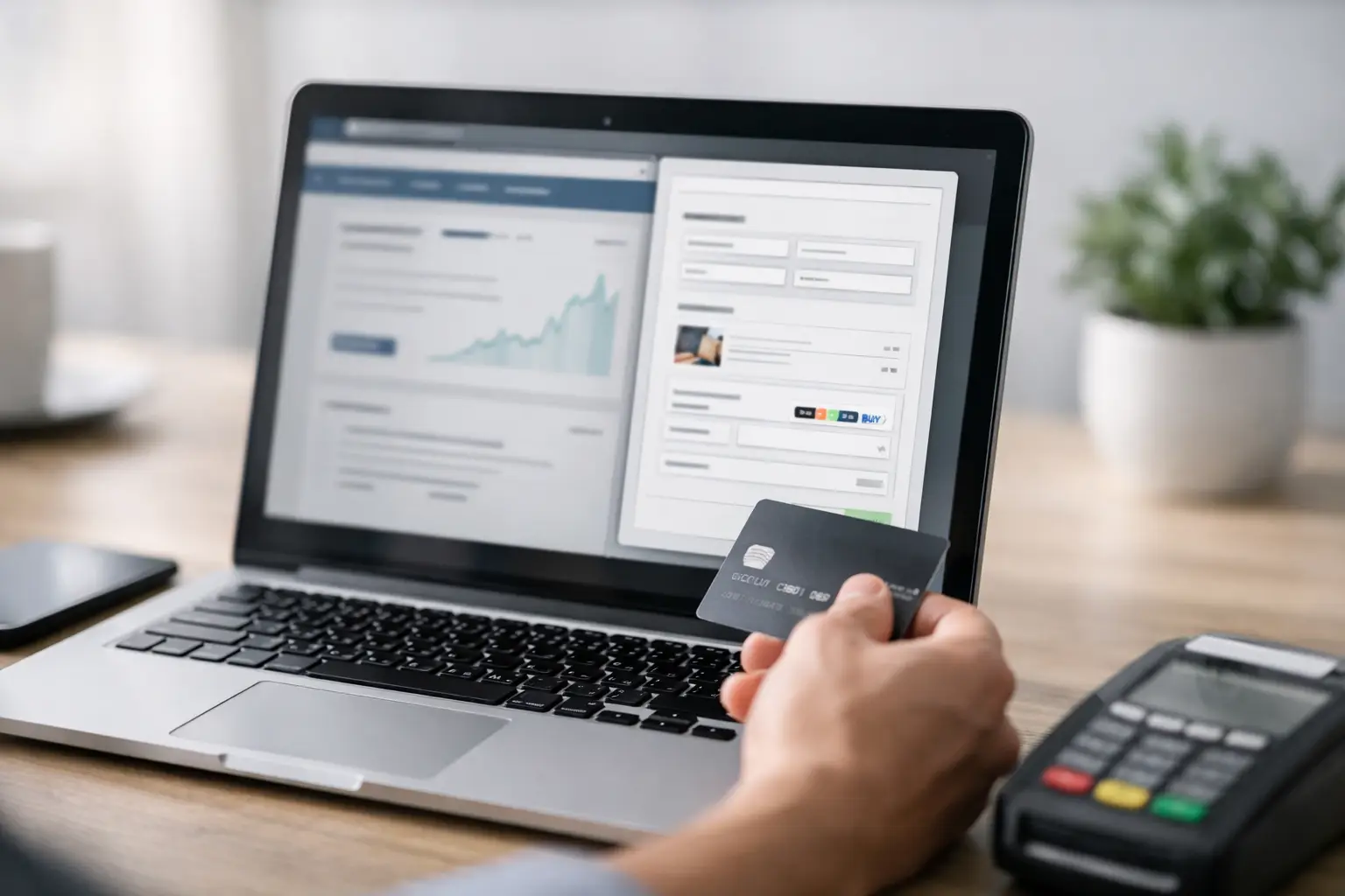
A checkout that sends people off to another page can cost you the sale before the payment form even loads. If you are working out how to embed checkout widgets, the real goal is not just technical placement. It is reducing friction, keeping intent high, and making payment feel like the next obvious step.
Embedded checkout works best when it sits close to the moment of decision. That might be a product page, a link-in-bio page, an event landing page, a donation page, or a client booking flow. The closer the widget is to the action that created buying intent, the fewer chances you give people to hesitate, compare tabs, or disappear.
Why embedded checkout works
A hosted checkout page still has its place. It can be cleaner to manage, easier to share, and sometimes better for complex transactions. But embedded checkout widgets win when speed matters and context matters more.
If someone is reading about a workshop, browsing a digital product, or booking a paid consultation, sending them elsewhere adds a break in the flow. An embedded widget keeps the transaction inside the page they already trust. That usually means fewer clicks, less drop-off, and better conversion visibility.
There is a trade-off. Embedded experiences need tighter page design, stronger mobile testing, and clearer handling for edge cases such as failed payments or slow-loading scripts. A widget is not automatically better just because it is on-page. It has to be placed well and configured with intent.
How to embed checkout widgets without hurting conversion
The technical embed is usually the easy part. The harder part is making sure the widget fits the page, the offer, and the user journey.
Start with the purpose of the page. If it is a sales page, the widget should appear after the key buying information, not before. If it is a donation page, the payment module should be visible early because intent is usually immediate. If it is a booking page, checkout often works better after the customer has selected a slot, service, or ticket type.
The main rule is simple: match the widget to the stage of commitment. Ask for payment too early and people stall. Ask too late and you add extra scrolling, backtracking, or second thoughts.
Keep the buying context intact
Your checkout widget should feel like part of the page, not a foreign block pasted into it. That means consistent branding, clear spacing, and copy that confirms exactly what the person is paying for.
Use the surrounding area to answer the last obvious questions. What is included? Is it one-off or recurring? When will access start? Is VAT included? If the widget handles one payment only but the offer has variables, the content around it has to do more work.
This is where many embedded checkouts underperform. The code works, but the page still leaves room for doubt.
Reduce fields wherever possible
The fastest payment flow is usually the one with the fewest decisions. If your widget or payment setup allows optional fields, be strict about what you collect.
You may need an email address, billing details, and perhaps delivery information. You probably do not need a company name, a phone number, and three custom questions for a £19 digital download. Every extra field asks the customer to pause, think, and type.
For higher-value services, you can justify more detail. For low-friction sales, lean towards speed.
Placement matters more than most teams expect
The same widget can perform very differently depending on where it appears.
Above the fold can work for known-intent traffic such as people arriving from an email campaign, QR code, or direct promotion. These visitors often already know what they want. Giving them a visible payment route early can shorten the path to conversion.
For colder traffic, pushing checkout too high can feel abrupt. In that case, lead with the offer, proof, outcomes, and price clarity first. Then place the widget after that decision-building content.
On mobile, placement needs even more care. A widget that looks compact on desktop can dominate the screen on a phone. Keep surrounding text tight, check button spacing, and make sure sticky banners or pop-ups do not block payment controls.
Inline, modal, or section-based embed
There is no single right format.
Inline widgets are best when checkout is the page's main job. They are visible, direct, and easy to understand. Modal checkouts can work when you want a cleaner page but still want payment on-page after a button click. Section-based embeds fit multi-purpose pages where users need to read, compare, and then act.
Choose based on user intent, not design preference. If the page exists to sell one thing, hiding checkout behind too many interactions often slows results.
Technical points that actually affect revenue
When teams talk about embedded checkout, they often focus on whether the script loads. That is only the baseline. What matters is whether the payment experience is reliable under real conditions.
Test page speed before and after adding the widget. Heavy scripts, poor image handling, or conflicting plugins can delay rendering and weaken trust. If the checkout area appears blank for too long, users assume something is broken.
Also test browser behaviour, mobile responsiveness, and error handling. What happens after a declined card? Does the customer stay on the page and try again, or do they get a vague message and give up? Does the widget resize properly inside your theme or CMS layout? Does the confirmation step make next actions clear?
These are not minor details. They shape whether the sale completes.
Security and trust signals
People do not inspect your payment stack in depth, but they do notice signs of competence. A clean embedded checkout, consistent branding, recognised payment methods, and clear confirmation messaging all reduce anxiety.
If you are using Stripe-powered payments through a platform such as flnk.it, the advantage is not just payment collection. It is centralised management of the surrounding assets too - links, campaign pages, bookings, forms, and tracking. That matters because checkout performance is rarely isolated. It sits inside the wider distribution and conversion journey.
Choosing the right pages for embedded checkout
Not every page needs a widget. Add checkout where intent is strongest and where the payment request feels natural.
Product pages are the obvious candidate, especially for digital goods, low-complexity services, tickets, and donations. Link-in-bio pages also work well when they act as a compact storefront. Campaign pages for events, fundraising, or launches benefit from embedded payment because urgency is usually high and distraction should be low.
For service businesses, an embedded widget can sit after a short qualification step or a booking selection. That avoids taking payment before the buyer knows exactly what they are getting.
A poor fit would be a broad homepage with multiple audiences and too many competing calls to action. In that setting, checkout can feel premature unless the homepage is built specifically for a single offer.
Measure more than completed payments
If you want embedded checkout to improve performance, track more than the final transaction count. Watch page visits, widget views, button clicks, checkout starts, payment completion, and abandonment points.
This tells you whether the issue is traffic quality, offer clarity, placement, or payment friction. If many users reach the widget but few start checkout, the problem may be weak trust or poor pricing communication. If many start but few finish, the problem is more likely in the payment flow itself.
Analytics also help you compare embedded checkout against hosted checkout pages. Sometimes the embedded version wins because it removes a click. Sometimes a dedicated checkout page wins because it is cleaner and more focused. It depends on the offer, the audience, and the source of traffic.
Common mistakes when embedding checkout widgets
The most common mistake is treating the widget as the strategy. It is only one part of the conversion path.
Another is overloading the page around it. Too much copy, too many competing buttons, or unrelated navigation can pull people away from payment. Poor mobile spacing is another regular issue, especially when embedded elements stack awkwardly.
Then there is message mismatch. If the ad, QR code, email, or short link promises one thing, but the page and widget present another, trust drops quickly. The handoff from traffic source to checkout has to be consistent.
A better way to think about embedded checkout
If you are deciding how to embed checkout widgets, think less about where the code goes and more about where commitment peaks. Place payment where user intent is strongest, keep the page focused, reduce avoidable fields, and test the flow on the devices people actually use.
The best embedded checkout does not demand attention. It removes excuses. When the offer is clear and the payment step sits exactly where it should, buying feels simple enough to finish.
Comments (0)
Be the first to comment.
Leave a comment