Most bio pages fail for a simple reason: they act like a link list when they should work like a sales surface. If you want to know how to create bio storefront pages that actually convert, start by treating the page as an operational asset. Every button, block and payment option should help someone take the next step quickly.
A bio storefront sits between attention and action. Someone taps your Instagram, TikTok, LinkedIn or creator profile because they are interested right now. Your job is to remove friction. That might mean helping them buy, book, enquire, subscribe, download or browse without getting lost in ten unrelated links.
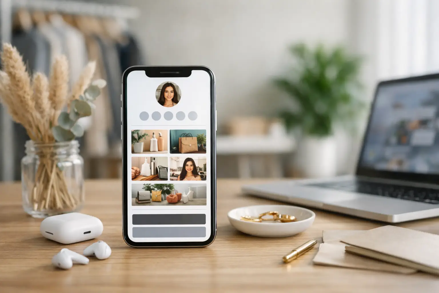
What a bio storefront needs to do
A strong bio storefront is not just tidy. It has a job. For a creator, that job might be selling digital products and growing an email list. For a consultant, it may be booking calls and collecting leads. For a small business, it could be directing traffic to bestsellers, appointment slots and support.
That is why layout matters less than clarity. Before you build anything, decide on the one primary action your page should drive. Then choose one or two supporting actions. If everything is a priority, nothing stands out.
You also need to think about intent. Some visitors are ready to buy. Others want proof first. Others just need a quick way to contact you. A good storefront serves those different states without becoming cluttered.
How to create bio storefront pages with a clear structure
The easiest mistake is starting with design instead of flow. Build the page in the order people make decisions.
Open with a short value statement. In one or two lines, say who you are, what you offer and who it is for. If a visitor lands on the page and still has to work that out, the page is already underperforming.
Then place your primary action at the top. If you are selling a guide, put the product first. If you are a coach, lead with booking. If you run events, make tickets prominent. The top section should answer the question, what can I do here right now?
Below that, add supporting sections in descending order of commercial value. That usually means featured products, services, bookings, lead magnets, testimonials and then general links such as blog posts or social channels. Social profiles are useful, but they should rarely outrank revenue-generating actions.
This is where an all-in-one platform has an advantage. Instead of sending traffic through a patchwork of checkout tools, form builders, booking apps and separate mini-sites, you can keep the experience inside one managed flow. That reduces drop-off and makes performance easier to track.
Choose the right content blocks
Not every bio storefront needs the same components. The right mix depends on what you are trying to monetise.
If you sell products, use product cards with clear names, pricing and a direct purchase path. If you sell services, use short service summaries with one booking or enquiry button per offer. If you build an audience first, use an email capture form with a concrete reason to subscribe.
For most users, the highest-performing storefronts include a profile header, one featured offer, a small group of supporting actions, proof and a direct contact route. Proof can be as simple as a testimonial, client logos, event attendance numbers or product download counts. It gives hesitant visitors a reason to keep moving.
Be selective. Cramming in every offer, every social profile and every old campaign usually lowers conversion. A storefront should feel active and current, not like an archive.
Design for speed, not decoration
People do not arrive on a bio page to admire interface flourishes. They arrive to decide. Your design should support that.
Keep branding consistent with the rest of your online presence. Use your logo or profile image, brand colours and type choices that are easy to read on mobile. Most traffic to a bio storefront comes from mobile devices, so test spacing, button size and scrolling carefully.
Use short labels. “Book a call” is stronger than “Click here to learn more about scheduling an introductory consultation”. “Buy the template” is stronger than “Explore this resource”. Direct language performs better because it reduces mental effort.
Visual hierarchy matters more than visual complexity. Make your primary action the most prominent element on the page. Keep enough spacing between sections so the page feels controlled, but do not force users to scroll through oversized banners before they reach something useful.
Build around measurable actions
A storefront should not just look clean. It should tell you what is working.
Track clicks, sales, bookings, sign-ups and conversion paths. If your top link gets traffic but no outcomes, the problem may be the offer, not the page. If a lower section converts better than the hero button, you may have misjudged user intent. Analytics turn guesswork into iteration.
This matters even more if you run multiple campaigns across social platforms, QR codes, email and paid traffic. When your storefront sits inside a wider link management and monetisation setup, you can see which channels produce valuable visitors, not just vanity clicks.
For example, someone promoting workshops might compare traffic from Instagram Stories, a speaker QR code and a newsletter mention. The storefront itself stays consistent, but the source data shows where real bookings come from. That is how a simple profile link becomes part of a working revenue system.
Common mistakes when learning how to create bio storefront pages
The biggest mistake is using the page as a dumping ground. A storefront with fifteen equal links asks the visitor to do the sorting for you. Most will not bother.
Another common issue is weak offer framing. “Resources” is vague. “Free pricing calculator” is specific. “Shop” is broad. “Buy the Notion content planner” tells people exactly what they will get. Precision improves clicks because it removes ambiguity.
Many users also hide commercial intent too far down the page. They lead with social links, then a newsletter, then a vague about section, and only later mention the product or service they actually want to sell. Reverse that order.
Finally, too many bio storefronts ignore trust. If you are asking for payment, booking details or contact information, include signals that reassure people. That could be testimonials, secure checkout, recognisable payment methods, transparent pricing or a short note on fulfilment.
A practical setup for different use cases
Creators usually do best with one featured product, one email capture offer and one section for current content or collaborations. Consultants and freelancers often need a tighter service-led structure: one core service, a booking button, a case study or testimonial, and a contact option for larger enquiries.
Ecommerce operators can use the page as a campaign storefront rather than a full catalogue. Feature bestsellers, seasonal items or bundles instead of trying to replicate the whole shop. Event organisers should prioritise registration, ticket tiers, dates and reminders. Nonprofits often need donation, campaign context and volunteer or contact actions arranged in that order.
The pattern is the same each time. Lead with the most valuable action. Support it with proof. Remove anything that slows the visitor down.
Keep the page operational, not static
A good bio storefront is maintained. Offers expire, campaigns change, products launch, booking availability shifts. If the page still promotes last quarter's webinar or an out-of-stock download, it sends the wrong signal.
Review the page regularly. Check top-performing links, dead ends, conversion rates and mobile usability. Refresh featured blocks based on what you are promoting now, not what looked good when you first published the page.
If your platform lets you manage links, payments, forms, bookings and campaigns from one dashboard, use that advantage fully. Tools like flnk.it are most useful when the storefront is connected to the rest of your workflow rather than treated as a standalone page. That connection makes it easier to update assets quickly, measure results accurately and keep every visitor path commercially useful.
The real goal of a bio storefront
The goal is not to fit your whole business into one page. It is to give profile traffic the fastest possible route to action.
That means fewer distractions, sharper offers and better tracking. When you build with that mindset, your bio storefront stops being a placeholder link and starts working like a compact sales and conversion layer across every channel you use.
If you are deciding what to change first, start by cutting one thing. Remove the least useful link, move your strongest offer to the top, and make the next click obvious. Small changes at that point in the journey tend to pay for themselves quickly.
Comments (0)
Be the first to comment.
Leave a comment