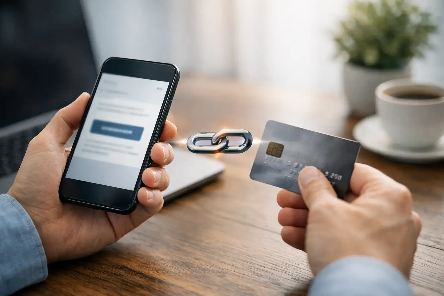
A customer is ready to pay, but your checkout flow asks too much of them. They need to visit your site, find the right page, fill in extra fields, and hope nothing breaks on mobile. If you want to accept payments through link, the faster model is simple: send one branded URL, let the customer open it anywhere, and remove every unnecessary step between intent and payment.
For freelancers, creators, consultants, event organisers, and lean teams, payment links are not just a convenience. They are a practical way to sell, bill, book, and collect without building a full ecommerce stack for every transaction. The real value is speed paired with control. You can share a single link in a DM, email, QR code, invoice, or landing page and still track performance, manage branding, and keep your payment flow tidy.
Why accept payments through link instead of a full checkout
A payment link works best when the buyer already knows what they are paying for. That could be a consulting session, digital product, event ticket, deposit, donation, or one-off invoice. In these cases, forcing people through a full store journey often adds friction rather than trust.
The gain is operational as much as commercial. You create the payment once, distribute it across channels, and keep the same destination everywhere. That matters when you are running campaigns across social posts, bios, newsletters, WhatsApp, QR codes, and direct outreach. Instead of rebuilding separate flows for each channel, the link becomes the transaction layer.
There is also a branding advantage. A plain, untracked payment URL can feel temporary or generic. A branded short link or payment page looks more deliberate, especially when it sits inside a broader system that also handles your QR codes, link pages, customer contacts, and campaign reporting.
That said, payment links are not the answer for every sale. If you run a large catalogue with complex shipping rules, discount logic, or multi-item baskets, a traditional ecommerce checkout may still be the better fit. The point is not to replace every system. It is to use the shortest route where the shortest route makes sense.
Where payment links work best
The strongest use cases all have one thing in common: the path to payment is already clear.
A freelancer can send a deposit link after a discovery call. A consultant can include a payment option in a proposal follow-up. A creator can sell access to a digital file from a link-in-bio page. An event organiser can add a ticket payment link to a QR code on printed materials. A nonprofit can distribute a donation link across email and social without forcing supporters through a bulky website journey.
Small businesses also use payment links well for repeatable services. Think repairs, classes, reservations, subscriptions, retainers, and pre-orders. In each case, the customer does not need to browse a catalogue. They just need a trustworthy, mobile-friendly way to pay now.
How to accept payments through link well
The mechanics are straightforward, but the performance depends on execution. A payment link should not feel like a loose end in your stack. It should feel like part of a managed flow.
Start with a clear payment purpose
Before creating the link, define whether it is for a single product, a service deposit, a donation, an appointment, or an event booking. This sounds obvious, but vague payment links cause unnecessary drop-off. The page should tell the buyer exactly what they are paying for, how much it is, and what happens next.
Clarity also helps internally. If you create links with a clear purpose, it is easier to track which channels convert, which offers perform, and which follow-ups are needed after payment.
Keep the page short and focused
A good payment page does not try to do the work of a homepage. It confirms the offer, supports the decision, and gets the user to checkout quickly. Add enough context to reassure the buyer, but do not bury the payment button under paragraphs of copy.
For services, include the outcome, timing, and any relevant terms. For events, include date, location, and what the ticket covers. For digital products, explain delivery and access. The buyer should not need to message you with basic questions before paying.
Use branded links and consistent presentation
Trust affects conversion. If the URL looks random, the page looks disconnected from your business, or the hand-off from message to checkout feels abrupt, people hesitate.
Branded short links, consistent naming, and a clean page layout help reduce that friction. They also make the link easier to share in places where space and attention are limited, such as social bios, SMS, or printed QR code campaigns.
Match the channel to the buyer
The same payment link can work across multiple channels, but the surrounding context should change. In email, you have room to explain the offer. In a DM, brevity matters. In a QR code, the destination page needs to do more of the selling because the scan often happens with very little context.
This is where a unified platform matters. If your links, QR codes, audience data, and payment collection live in one place, you can adapt distribution without losing visibility.
Tracking matters more than most teams expect
A payment link is only useful at scale if you can measure it properly. Otherwise, it becomes another blind spot.
When you track clicks, scans, conversions, and source channels, you can see whether the issue is poor traffic, weak messaging, or a payment page that needs work. That changes decision-making. Instead of guessing why a campaign underperformed, you can adjust with evidence.
For example, if a QR campaign gets plenty of scans but few payments, the problem may be the page experience. If an email gets strong clicks but weak completion, the pricing or timing may be off. If one creator page consistently converts better than another, you can replicate the structure.
This is one of the biggest differences between simply sending a payment URL and building a payment workflow. The link is not just a shortcut. It is a measurable asset.
Common mistakes when you accept payments through link
The first mistake is treating the link as the whole strategy. A payment link still needs context, trust, and follow-through. If the buyer does not understand what they are paying for, no shortcut will save the conversion.
The second is sending too many versions of the same payment. That creates confusion across teams and channels. One centralised link per offer is usually easier to manage than half a dozen near-duplicates scattered across messages and landing pages.
The third is ignoring post-payment actions. Once someone pays, what happens next? They may need a booking confirmation, event details, download instructions, or a follow-up email. Payment collection is only one step in the transaction. The stronger setup connects payment to delivery, contact management, and future communication.
The fourth is relying on unbranded tools that do not fit the rest of your operation. Saving a few minutes upfront can cost you reporting accuracy, customer confidence, and a lot of manual admin later.
One dashboard beats a stack of disconnected tools
This is where many businesses hit the same wall. They start with a payment processor, then add a QR tool, then a link-in-bio tool, then a mailing platform, then a booking app, then a spreadsheet to hold it all together. Each tool solves one problem while creating another.
If your goal is to sell and collect faster, consolidation matters. A platform that lets you create links, publish pages, generate QR codes, take payments, track responses, and manage contacts from one workspace gives you more than convenience. It gives you consistency.
That is especially useful for businesses running multiple transaction types at once. You might be selling digital products, collecting retainers, promoting events, and running email campaigns to past customers. In a split stack, every hand-off adds friction. In one system, each touchpoint supports the next.
For teams with technical requirements, the upside goes further. API access, embeddable widgets, and integrations let payment links fit into existing workflows rather than sitting outside them. For non-technical users, templates and no-code builders keep things moving without developer time. That balance is where platforms like flnk.it become practical, not just feature-heavy.
When to use a payment link, page, or QR code
Use a direct payment link when the buyer is already warm and the offer is simple. Use a payment page when the customer needs a little more context before acting. Use a QR code when the transaction starts offline, on packaging, at events, in-store, or in printed materials.
The format depends on the environment, not just the payment itself. A strong setup lets you move between them without rebuilding the offer each time.
Accepting payment should not require a maze of tools or a full website journey for every transaction. If you can turn a link into a branded, trackable, well-placed payment path, you make it easier for people to buy and easier for your team to operate. The smartest payment flow is usually the one that gets out of the way.
Comments (0)
Be the first to comment.
Leave a comment