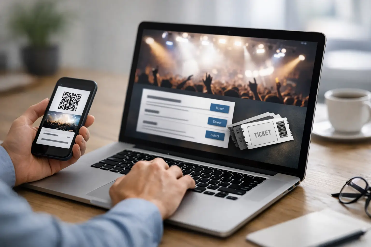
A potential attendee has clicked your post, scanned your QR code or opened an email. At that point, event ticket sales pages have one job: make the decision to attend feel easy, credible and worth paying for. A clever campaign can create attention, but a confusing checkout page can lose the sale in seconds.
For organisers, creators and teams running paid workshops, fundraisers, launches or live events, the ticket page is not an administrative afterthought. It is the point where distribution becomes revenue. It needs clear information, a reliable payment path and enough context to answer the questions that stop people from booking.
Start with the attendee’s decision
People rarely arrive on a ticket page ready to read every detail. They want to know what the event is, whether it is for them, when and where it happens, and what they need to pay. Lead with those answers.
Your event name should be specific enough to set expectations. “Spring Networking Evening” is serviceable, but “Spring Networking Evening for Manchester Creative Freelancers” gives the right visitor an immediate reason to continue. Pair it with a short description that explains the outcome, not just the format. A workshop might help attendees build a portfolio, learn a process or meet prospective partners. State that value plainly.
Place the date, start and finish time, location or joining details, and ticket price close to the booking action. Do not make visitors search through a long event description to find basic logistics. If the venue is online, say which platform you will use and when the access details will arrive. If it is in person, include the full venue name and practical arrival guidance where useful.
The right amount of detail depends on the commitment. A £10 social event can be concise. A full-day, £250 training session needs a fuller agenda, speaker credentials, what is included and clear cancellation terms. The more money, travel or time an attendee must commit, the more certainty they need before paying.
Build event ticket sales pages around one action
A high-performing ticket page should have a clear primary action: choose a ticket and complete the booking. Secondary actions can exist, but they must not compete with that route.
Avoid sending visitors from the page to several separate tools for registration, payment and confirmation. Every extra hand-off creates doubt and gives people a chance to abandon the process. A unified workflow keeps the event details, ticket selection, payment collection and attendee records connected.
Use a visible button with direct language such as “Book your place”, “Get tickets” or “Register now”. Generic wording such as “Submit” gives no reassurance about what happens next. Repeat the booking action after longer sections, especially after an agenda, speaker section or FAQ. This is not pressure. It is good page design for visitors who decide at different moments.
Ticket options also need discipline. If you offer early-bird, standard and VIP access, explain the difference in one or two lines per option. Include availability limits and deadlines when they are real. Artificial scarcity damages trust, while genuine capacity information helps people act before a room or session fills up.
For free events, registration still matters. Capturing attendance details lets you plan capacity, send reminders and follow up afterwards. It also gives you a clearer picture of which channels produce registrations that actually turn up.
Make payment feel safe and predictable
Payment friction is often less about price than uncertainty. Attendees want to know that the payment method is familiar, the charge is secure and their booking will be confirmed immediately.
Keep the checkout fields to what you need to run the event. Name, email address and ticket choice are usually essential. Dietary requirements may matter for a catered event. A detailed company profile probably does not, unless it directly shapes the experience. Every unnecessary field asks visitors to do more work before they can pay.
Be clear about fees and tax before the final payment step. A ticket advertised at one price that becomes noticeably more expensive at checkout creates avoidable drop-off. The same applies to refund policies. Put the policy in plain English on the page: whether tickets can be transferred, the deadline for refunds and what happens if the organiser has to reschedule.
Confirmation is part of the sale, not merely a receipt. Send a prompt confirmation containing the event name, date, location, ticket type and next steps. For online events, tell attendees when they will receive their joining link. For in-person events, include essential venue information and a contact route for questions.
Give people a reason to trust the event
Most ticket pages need proof, particularly when the organiser is new to the visitor. Trust comes from specificity, not inflated claims.
Name the host, speakers or performers and explain why they are relevant. Use a short biography focused on the experience attendees will receive. If your event has run before, mention meaningful evidence such as returning attendees, partner organisations, previous editions or feedback. A vague statement that an event will be “unmissable” does little; a clear agenda and credible presenter do much more.
Visuals should help people picture the experience. Use a strong event image, venue photograph or speaker imagery rather than decorative stock photography. For recurring events, photos from earlier sessions can reduce uncertainty by showing the scale, setting and atmosphere. Make sure text remains readable on mobile screens, where many ticket purchases begin.
Accessibility supports trust as well. Use readable type, sensible contrast and straightforward labels. Describe access arrangements where relevant, including step-free entry, captions, seating, quiet spaces or dietary provision. These details help attendees decide with confidence and signal that the event has been organised properly.
Connect promotion to measurable demand
A ticket page cannot improve if you cannot see how visitors found it. Each promotional channel should be trackable, whether it is a social post, a partner newsletter, a printed flyer or a QR code at a previous event.
Use separate branded links for major campaigns so you can compare clicks, registrations and paid tickets. A post that attracts plenty of traffic but few bookings may be reaching the wrong audience, setting the wrong expectation or landing visitors on a page that does not answer their questions. A channel with fewer clicks but stronger sales may deserve more budget and attention.
QR codes are particularly useful for physical promotion. Put one on posters, slides, printed programmes or partner displays, then point it directly to the relevant ticket page. If the campaign changes, a managed destination lets you update the route without reprinting every asset. That is practical when an early-bird ticket sells out, a venue changes or you need to switch from a waiting list to standard registration.
Email should continue the journey after someone registers. Send a confirmation immediately, a useful reminder before the event and any final practical information at the right time. For multi-session programmes, segmented messages can keep each ticket holder informed without sending irrelevant updates to everyone in your contact list.
Test the booking journey before you promote it
A ticket page can look polished and still fail at the point of purchase. Test it as an attendee would, preferably on a mobile phone as well as a desktop browser. Check that ticket quantities work, payment completes, confirmation emails arrive and calendar, venue or joining details are accurate.
Review the page after the first wave of traffic. If people are clicking but not buying, begin with the basics: price clarity, page speed, mobile layout, ticket availability and payment options. Do not rewrite everything based on a handful of visits. Look for patterns over enough traffic to distinguish a real issue from normal variation.
It can also be useful to test the order of information. Some audiences need the agenda before they book; others respond faster when price and availability appear first. Corporate training buyers may want outcomes and invoicing details, while community event attendees may care more about location and who will be there. The page should reflect the actual decision your audience is making.
Use one workspace from promotion to attendance
The operational value of a ticket page increases when it is connected to the rest of your event activity. When links, QR codes, payments, contacts and email messages live in separate systems, reporting becomes slower and follow-up becomes harder to manage.
A platform such as flnk.it can bring those moving parts into one workspace: create a branded link or QR code, publish the event page, collect Stripe-powered payments, manage attendee contacts and send reminders from the same operational flow. That reduces manual exports and gives organisers a clearer view of what is driving ticket revenue.
Your event page does not need more noise to sell more tickets. It needs the right answers, a short route to payment and a reliable follow-up process. Build it around the attendee’s next decision, then let every campaign point to that same clear destination.
Comments (0)
Be the first to comment.
Leave a comment