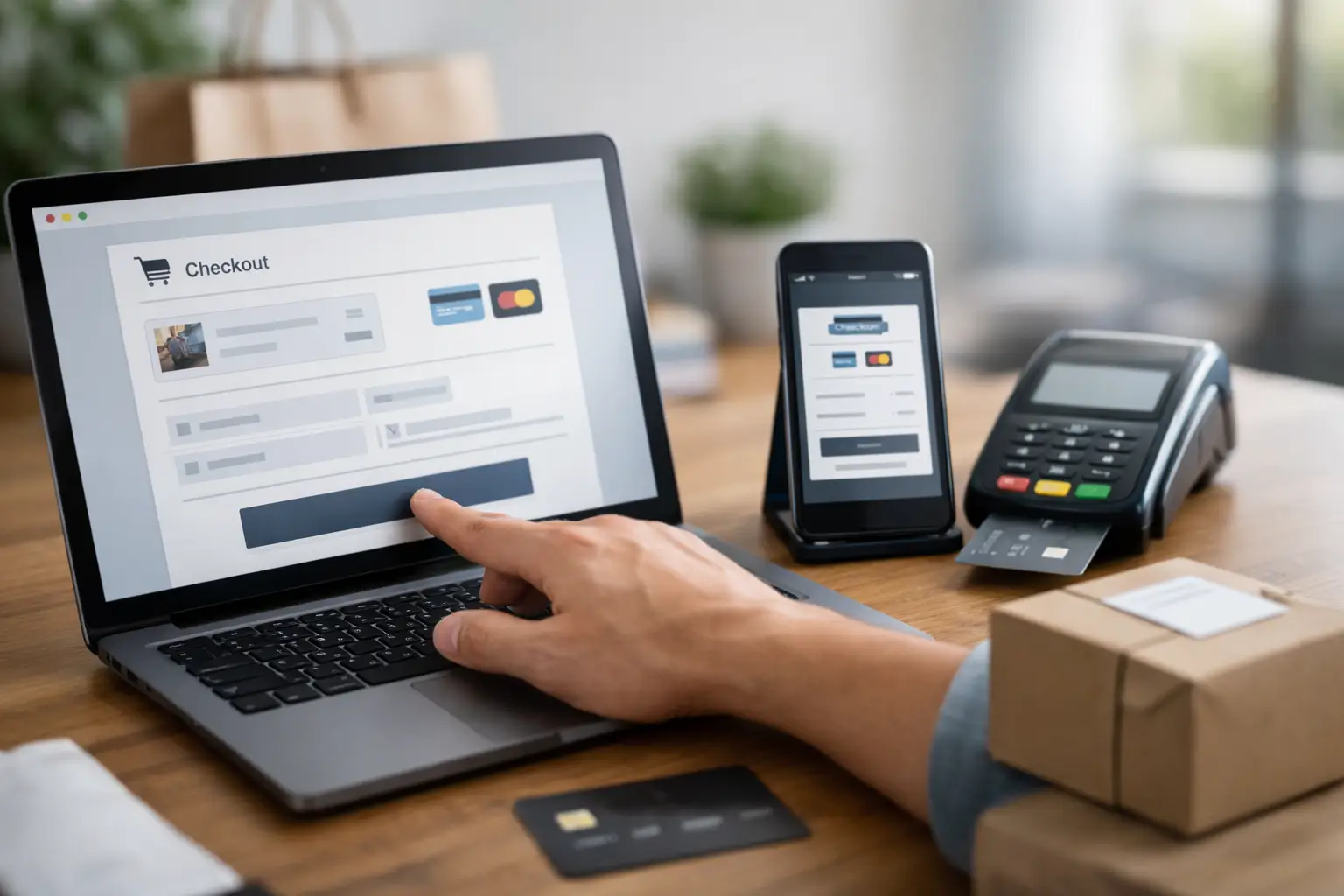
A checkout that looks fine in a demo can still leak revenue the moment real buyers hit it. The best digital product checkout is not the one with the longest feature list. It is the one that gets people from intent to payment to delivery with the fewest delays, the least doubt, and no operational mess behind the scenes.
That matters even more with digital products because the buyer expects speed. If someone is paying for a template, a download, a licence key, an online resource, or access to gated content, they do not want to wait for manual fulfilment or sift through a clumsy payment flow. They want to pay, receive, and move on. If the process feels slow or disjointed, conversion drops fast.
What the best digital product checkout actually needs to do
A good checkout is not just a payment form. It is the point where pricing, trust, fulfilment, and data all meet. That is why many sellers get into trouble when they patch together separate tools for payments, delivery, email confirmations, audience tracking, and support. Each extra handoff creates another place for something to break.
The best digital product checkout should handle four jobs well. It should make payment quick, reassure the buyer, deliver the product immediately, and feed useful data back into the rest of your workflow. Miss one of those and the checkout might still work, but it will not work efficiently.
Speed comes first. Fewer fields usually mean better completion rates, especially on mobile. Buyers should not have to create an account unless there is a genuine reason. If the product is low-friction by nature, the checkout should match that. Every added step needs to earn its place.
Trust comes next. Digital products can trigger hesitation because there is nothing physical arriving through the post. Clear product naming, transparent pricing, recognisable payment handling, and a professional branded experience all help reduce uncertainty. A checkout that feels generic or disconnected from the seller's brand tends to underperform, even if the product itself is strong.
Delivery is where many setups fall apart. If the customer has paid but cannot access the file, booking, code, or confirmation straight away, support tickets start piling up. That is not just bad service. It is wasted time and margin.
Then there is tracking. You need to know what was sold, where buyers came from, which links converted, and where drop-off happened. Without that, improving conversion becomes guesswork.
How to evaluate the best digital product checkout for your business
The right checkout depends on what you sell and how you sell it. A creator selling a one-off download has different needs from a consultant selling paid bookings or a developer selling source code access. Still, the same evaluation framework applies.
Start with the buying context. Are customers coming from social media, a QR code, an email campaign, a bio page, or a direct landing page? If most of your traffic is mobile, then mobile payment experience matters more than desktop polish. If buyers are coming from a warm email audience, trust may already be high, so speed becomes the main lever. If they are discovering you from a shared link, your checkout needs to do more reassurance work.
Next, look at fulfilment. Some digital products are simple file deliveries. Others involve registrations, tokenised access, confirmations, licences, or time-based bookings. The checkout should fit the fulfilment model rather than force you into workarounds.
Then consider operational overhead. A checkout is not only about what the customer sees. It is also about what your team has to manage after the sale. If staff have to manually reconcile payments, send separate follow-up emails, update contacts in another system, or build custom reports from scattered tools, the total cost is higher than it looks.
Best digital product checkout features that affect conversion
There is no single perfect feature stack, but a few capabilities consistently make a difference.
Branded checkout pages matter because they reduce visual friction. When the payment step clearly matches the link, landing page, or mini-site the buyer came from, confidence improves. This is particularly important for freelancers, consultants, and small businesses that need to look credible without building a custom commerce stack.
Fast payment processing is obvious, but payment flexibility matters too. Depending on your audience, one method may outperform another. The point is not to add every possible option. The point is to support the methods your buyers already trust.
Immediate delivery is non-negotiable for most digital products. Whether that means access to a downloadable asset, an event ticket, a booking confirmation, or a code package, the process should feel instant and predictable.
Clear post-purchase communication is often underrated. Buyers should know what they paid for, what happens next, and where to find it again. A vague receipt creates unnecessary uncertainty. A precise confirmation reduces support and increases repeat trust.
Finally, analytics should be built in rather than bolted on. If your checkout sits inside the same environment as your links, campaigns, contacts, and pages, you can see the whole path from click to payment. That is far more useful than staring at isolated payment records.
Why stitched-together tools often weaken checkout performance
A lot of businesses start with a practical mindset: one tool for links, one for pages, one for payments, one for bookings, one for email, and perhaps another for contact records. That can work at low volume. The problem appears when you want cleaner reporting, quicker launches, and fewer moving parts.
Every separate tool introduces friction. Branding becomes inconsistent. Tracking gets fragmented. Customer data lives in different places. Delivery logic becomes harder to test. Even small changes take longer because they affect multiple systems.
That is why the best digital product checkout is often part of a wider operational setup rather than a standalone payment screen. If you can create the link, publish the page, collect the payment, capture the contact, trigger follow-up communication, and measure performance from one place, you remove a lot of avoidable delay.
For teams and solo operators alike, consolidation usually improves execution. It is easier to launch offers quickly, test pricing, route traffic from different campaigns, and spot what is working. flnk.it fits this model well because selling, sharing, tracking, and contact management sit together instead of being spread across disconnected tools.
Trade-offs to keep in mind
More features do not automatically mean a better checkout. If the setup is too flexible, it can become harder to maintain. If it is too basic, it may not support the way you actually sell. The best choice sits in the middle: enough capability to support your business model, without creating extra configuration burden.
Customisation is another trade-off. Full control sounds attractive, but many businesses do not need a heavily bespoke checkout. They need something reliable, branded, and fast to deploy. Unless your conversion model depends on very specific custom logic, simplicity usually wins.
There is also a trade-off between broad compatibility and tight integration. A checkout that plugs into everything can be useful, but if your core workflow already lives in one platform, deeper native connection often delivers more value than wide but shallow compatibility.
A practical test for choosing the best digital product checkout
If you are comparing options, do not start with a feature table. Start with a real purchase journey. Build one product, send traffic from one channel, and test the whole path on mobile and desktop.
Check how long it takes to go from click to payment. Check whether the product description is clear enough at the payment stage. Check what the confirmation looks like and whether delivery is immediate. Then check what data you get back. Can you see source performance? Can you identify buyers easily? Can you act on that information without exporting data into three other systems?
If the answer is no, the checkout may still process payments, but it is not helping the business run better.
The strongest setups usually feel boring in the best way. Payment works. Delivery works. Reporting works. Buyers do not hesitate, and your team does not chase avoidable admin. That is the standard to aim for.
When you are choosing the best digital product checkout, think beyond the payment box on the screen. The real win is a checkout that shortens the path to revenue and keeps the rest of your operation just as efficient.
Comments (0)
Be the first to comment.
Leave a comment